
ConnectNGive
Real-time COVID-19 Shortages & Donations
Worked with a team of designers to create a user-friendly experience for a non-profit, community-driven response site that strives to connect under-represented groups with applicable PPE resources based on real team inventory and shortage updates.
Role
Volunteer UX Designer
Time
May 2020 - November 2020
Tools
Figma

🦠 Introduction
When the pandemic hit and lockdowns were in effect, I felt beyond grateful to have secured a job amid COVID-19. Professionally, my work helped with the national security response to the pandemic. However, I still sought ways to use my skillset to make a real-world impact during a global pandemic. Fortunately, I found the perfect opportunity through ConnectNGive. A group of young designers and engineers teamed up to create a platform to connect those who have PPE to those in need of PPE.
🍎 Mentoring
Because the team was composed of a mix of young designers in the industry and young designers in college, it provided many opportunities to provide mentorship. I was able to offer feedback in design reviews and time to shadow my work. I remember wanting a mentor to guide me through the design process when I was in university, and I was thrilled to be able to share my experiences with designers curious about what to do next.
📊 Site Statistics Dashboard
I was tasked with working on a variety of projects, allowing me to contribute to UX design work, QA testing, and working directly with new developers. My main project was improving the site’s statistic dashboard. For this project, we wanted to design a solution that would bring useful insights to multiple users: the internal ConnectNGive team, donors, receivers, and lawmakers. While the site had an existing statistics dashboard, my role was to transform the data into visualizations that made the information more valuable and consumable.
Time Frame: 2 weeks
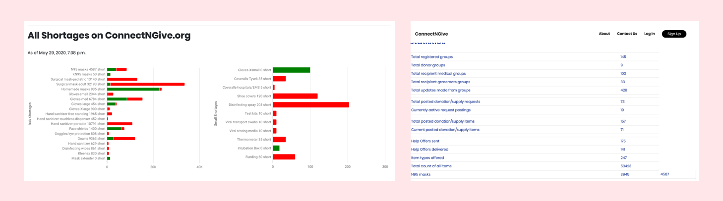
Existing site statistics dashboard
🔧 The Problem
The current site statistics dashboard was challenging to navigate and confusing to understand the data. The visualization of the information was making it difficult to digest anything meaningful. To understand more about what we were looking to accomplish with the site statistics dashboard, I spoke with the platform committee to find what they were looking to accomplish. Based on the conversations with them, there were three distinct groups to cater to in this one dashboard:
ConnectNGive advisors wanting to see how the platform is doing
ConnectNGive donors and receivers wanting to see how they are contributing
Lawmakers and legislatures to understand the impact of ConnectNGive
✏️ Wireframing and Initial Designs
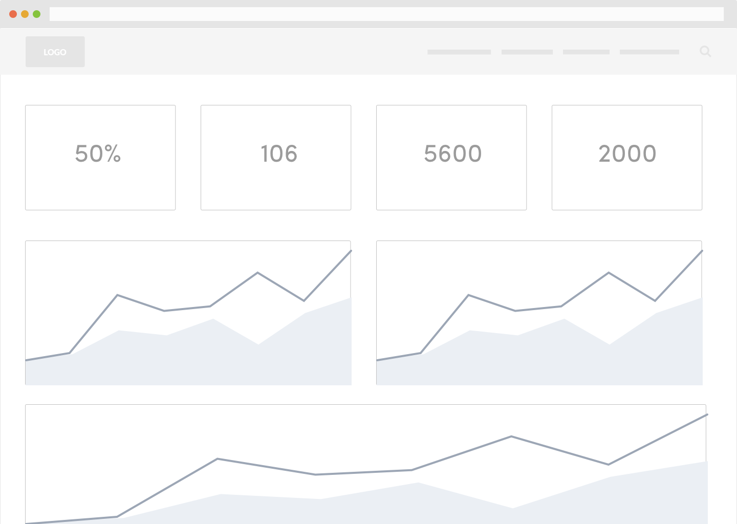

For any user, what was the essential information they needed to digest? What would they check most frequently? After some initial research on efficient layouts of dashboards, I created a wireframe to get a sense of how the dashboard should be structured. I decided to structure the layout of the page from a high-level overview to a granular inspection.
While the initial design was an improvement from the existing dashboard, there still some questions the dashboard didn’t answer:
How much has it changed from the last time I checked in?
How would the progress bar handle 24 different types of PPE?
What’s the meaning behind the labels?
🌱 Final Design and Conclusion
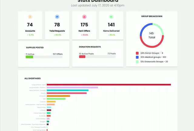
Reviewing the design with the team and doing more research on different types of data visualizations, I had many great ideas to work with. The finalized design was more visual, quickly telling the users when the data was updated and how much has changed since the last update. Moreover, I prioritized demonstrating what items recipients most needed. And lastly, if users wanted to see what is being delivered most, they could see a visual breakdown in a treemap.
This design is currently in development but will be crucial in demonstrating ConnectNGive’s impact. In exciting news, ConnectNGive’s work has been more efficient than the White House and the legislature has approved ConnectNGive to be considered for a 2021 bill this November.