
The Washington Post
Gift Subscriptions
Reimagining the Post’s gifting experience and increasing gift subscription redemption rates through improved clarity in flow, information hierarchy, and copy.
Role
Product Designer, Mentor
Time
June 2022
Identifying an Opportunity Area
This project began while mentoring our talented product design intern through my opportunity identification process. As part of the Subscriptions team at The Washington Post, we are allocated time to explore personal ideas that have the potential to enhance user experiences and address critical business needs. During the 2021 holiday season, I designed a gift subscription survey, which served as initial inspiration for delving deeper into the existing workflow, strategically timed to align with The Post’s plans for internationalizing gift subscriptions.
What started as a spark of curiosity evolved into a comprehensive investigation of the gift subscription process. I conducted a detailed analysis of its current strengths and areas for improvement by reviewing user feedback from the 2021 survey, examining relevant industry trends, and analyzing metrics and data from our existing gift subscription performance. This thorough exploration laid the foundation for developing meaningful enhancements to the user experience.
End to end review
When thinking about the holistic gifting experience, there were two main flows to consider: the flow for the user who is buying the gift (gifter) and the user receiving the gift (recipient/redeemer). To understand the current gifting ecosystem and to identify creative opportunity areas, we conducted internal analyses and usability tests of each flow.
Current Gifter Flow
The gifter flow consisted of the purchasing checkout page, the confirmation page after the user successfully checks out, and a confirmation email.


Key Insights
( 1 ) From the usability test, 2/5 users incorrectly said that they would put their own information into the recipient field, which pointed to the confusing and unclear copy on the purchasing/checkout page.
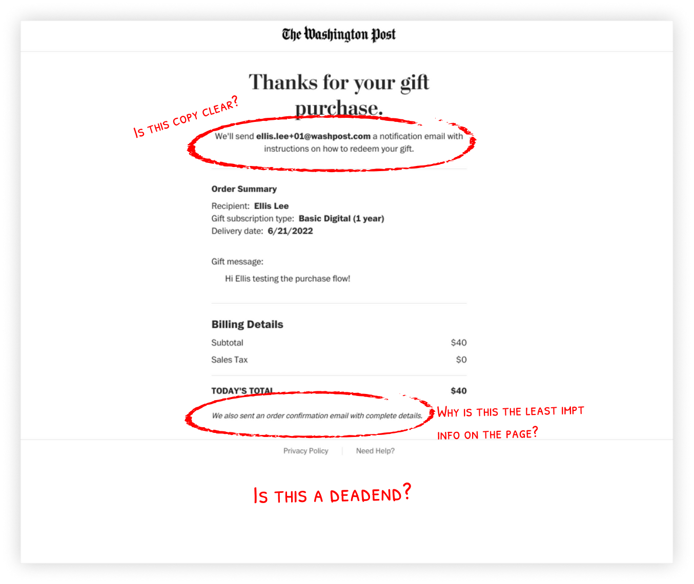
( 2 ) Many users cited they were interested in purchasing another gift subscription but felt confused and frustrated that they didn’t know how to buy another. The confirmation page is a dead-end, and the user has no choice but to close the tab. This was also confounded with feedback from the 2021 survey, which users complained of the difficulty of purchasing multiple gift subscriptions.
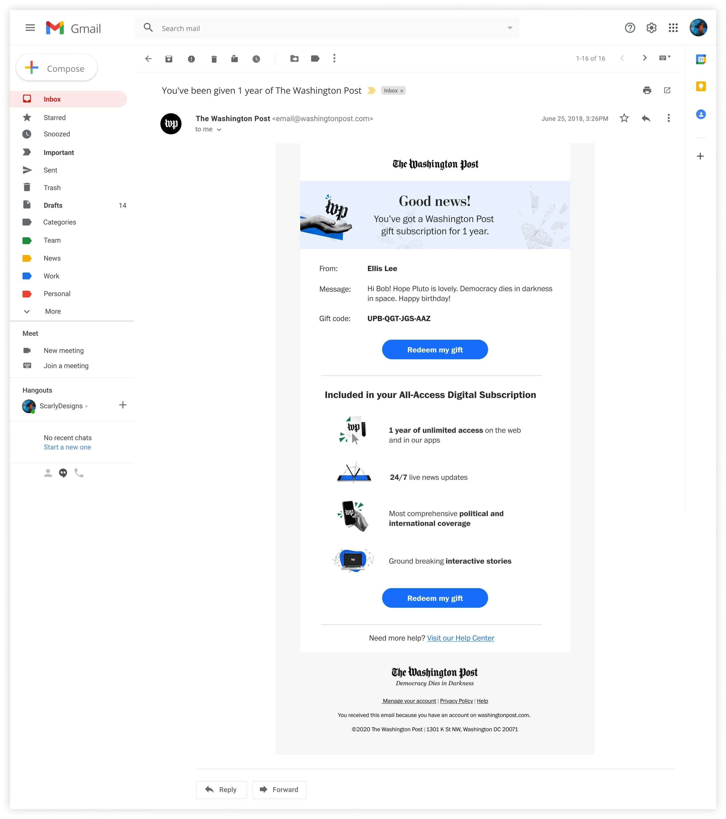
( 3 ) The confirmation email includes irrelevant information. There seems to be a lot of confusion as to why the user’s account management settings are there. 3/5 users said that this was a spam message due to the visual designs being outdated and not aligning with the current brand guidelines.
( 4 ) The outdated visual email designs didn’t align with the updated email design templates and brand guidelines.
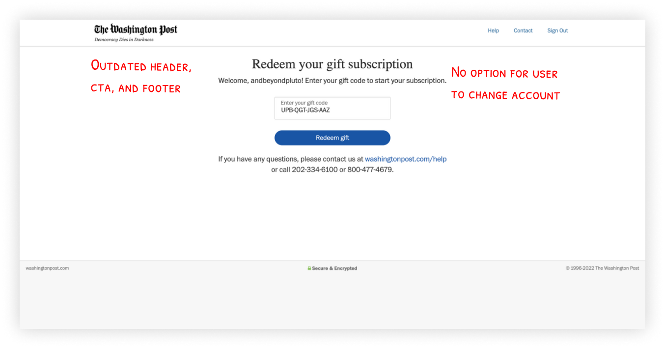
Current Recipient Flow
The recipient flow consisted of the recipient email, redemption page, and a welcome/confirmation page.


Key Insights
( 1 ) From the usability tests, 3/5 users said that they were suspicious and confused by the email notification, and 4/5 said that they would message their friend because they thought it was a scam. These responses highlighted the glaring issue of lackluster user trust in this experience.
( 2 ) Share more information about the gift to the recipient to build user trust and transparency about what they are receiving.
( 3 ) There was an opportunity to add the onboarding flow after the confirmation page to establish a relationship and nurture the new users for future engagement.
( 4 ) The outdated visual designs don’t align with the design system and brand guidelines.
Internal Review and Analysis
After looking at the current gift subscription data, we were shocked to see that 26.30% of people who were gifted a Washington Post subscription did not redeem it. This meant that the Washington Post had lost $1.1 million dollars in revenue each year, and this experience had not been touched in over 7 years.
Additionally, after talking to a representative from the Customer Care department, we learned that each time there is a gift subscription promotion, it resulted in hundreds of customer service hours spent on relieving related problems. The gift subscription Black Friday promotion just the year before resulted in 1,700 related tickets and an increase of 75 on-call engineers. Two of the most common Customer Care issues included:
1. Recipients not knowing how to redeem their gifts.
2. The gifters were not sure if the recipient had redeemed their gift.
Comparative Analysis
In addition to the usability tests and internal analyses, we conducted a comparative analysis of other companies’ gifting experiences, and these companies ranged from the Washington Post’s direct, indirect, and potentially encroaching competitors. The two most notable experiences being:
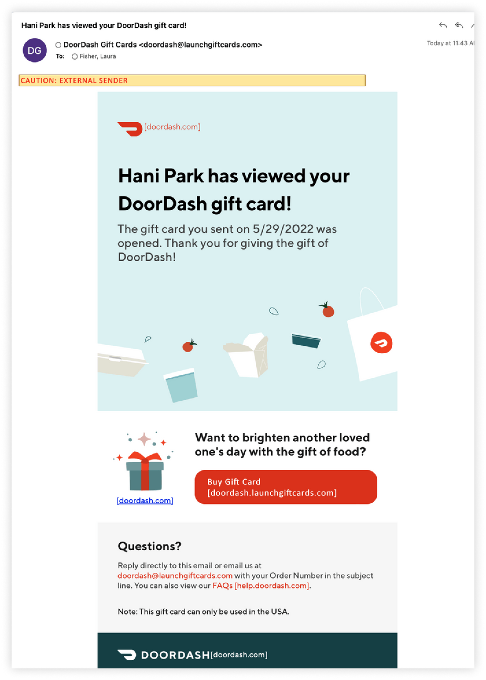
DoorDash
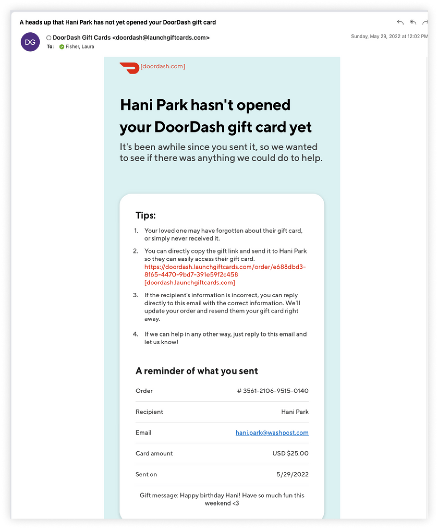
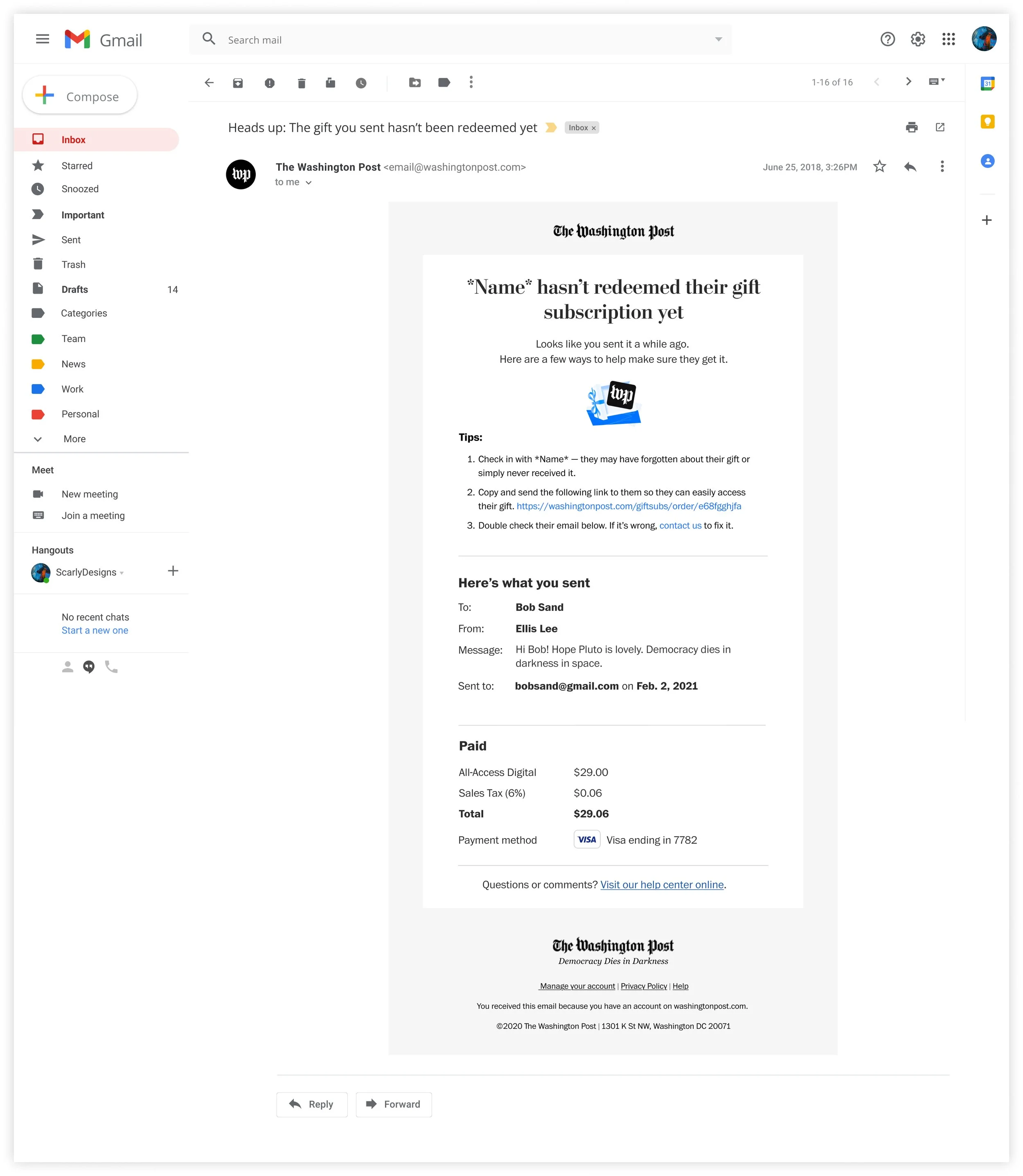
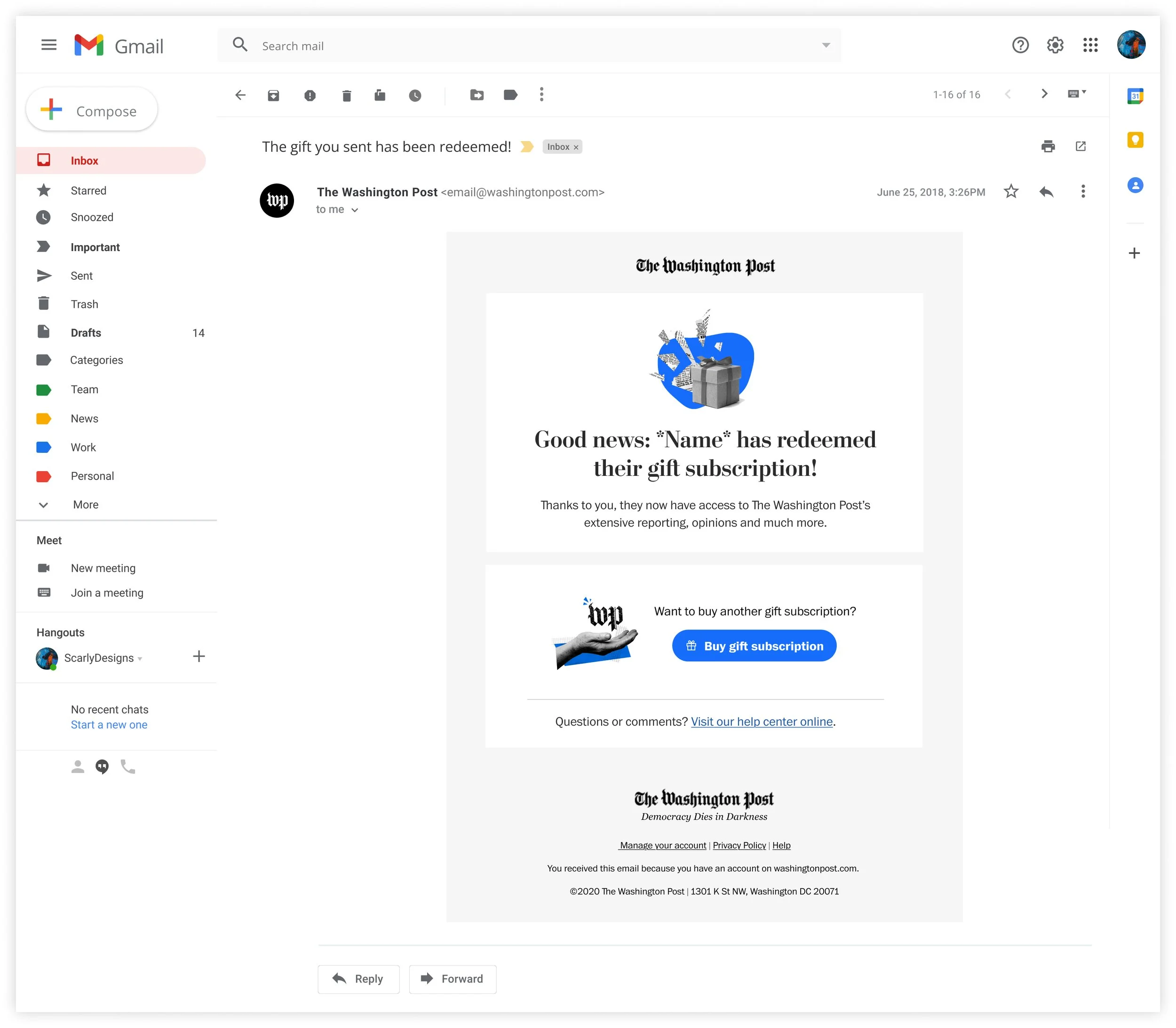
Through chance of being gifted a DoorDash gift card for work, we were able to get insight to their gifting and receiving flows. We saw that DoorDash sends a follow up email to the gifter notifying them that the recipient did not redeem their gift yet. This helps users to resolve their issues easily, increases the redemption rate for recipients, and builds more transparency throughout the experience. The email included tips to self-resolve redemption problems, which could prevent the extreme amount of customer care tickets that the Washington Post receives. Afterwards, DoorDash would send another email that includes a CTA to buy another gift once the recipient redeemed their gift which further enhanced transparency and eliminated confusion.
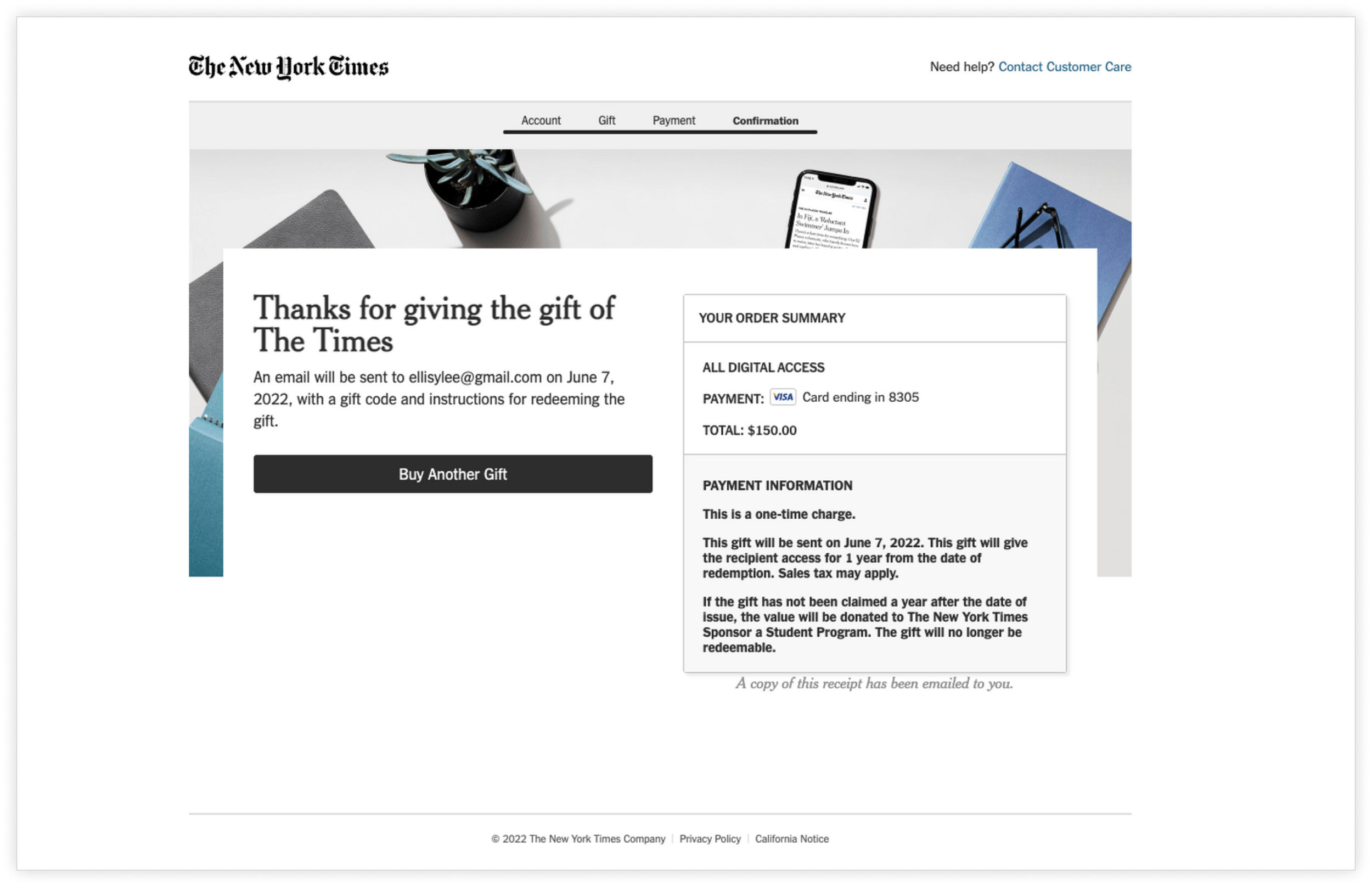
New York Times
New York Times’ most notable gift flow experience was the “Buy Another Gift” CTA on their purchase confirmation page. This helps the user easily buy more subscriptions while also increasing NYT’s gift subscriptions.
Concepting
As we began concepting how we could improve the overall experiences for gift subscriptions, we started with overhaul designs that incorporated our learnings from our discovery phase.

And as we designed we further refined into an MVP - with upcoming the opening of gift subscriptions to an international audience, we focused our efforts to the minimal changes we could make to the experience that would have the maximal effect.
✨ Final Designs
💝 Gifter
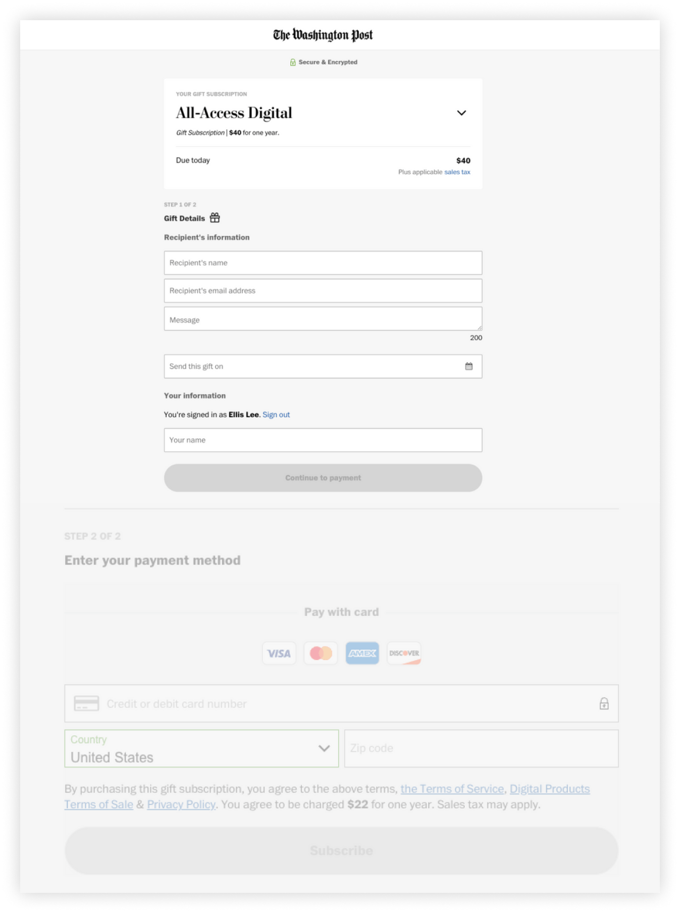
On the checkout page, we made simple changes to the copy to add clarity. Updating the copy from “Recipient’s information” and “Your information” to humanizing and contextualized copy, “Who is this gift for?” and “Who is this gift from?”. The latter, also opening up opportunity for users who are gifting as an organization or group. We also clarified the CTA to say “Buy gift subscription” rather than “Subscribe”. that would have the maximal effect.
Before

After
On the confirmation page, we added the ability to by another gift subscription as well as eliminating the dead-end in the experience and increasing recirculation rate by adding “Or continue to today's news” as a CTA. We also updated the information heirarchy of the page to not only present the most relevant information to the user but also let us utilize our existing confirmation page layout for subscriptions.
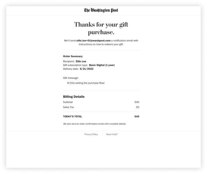
Before

After
Using our existing email templates, we worked with our content designer to strike the right tone of happiness and useful information.

Before

After
Inspired by DoorDash, we added two new emails to the series: One for when the recipient has yet to redeem their subscription and one for when they have.
🎁 Recipient
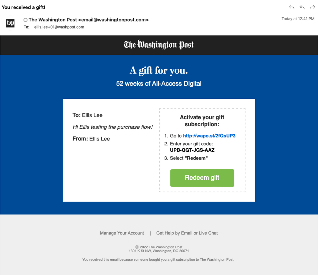
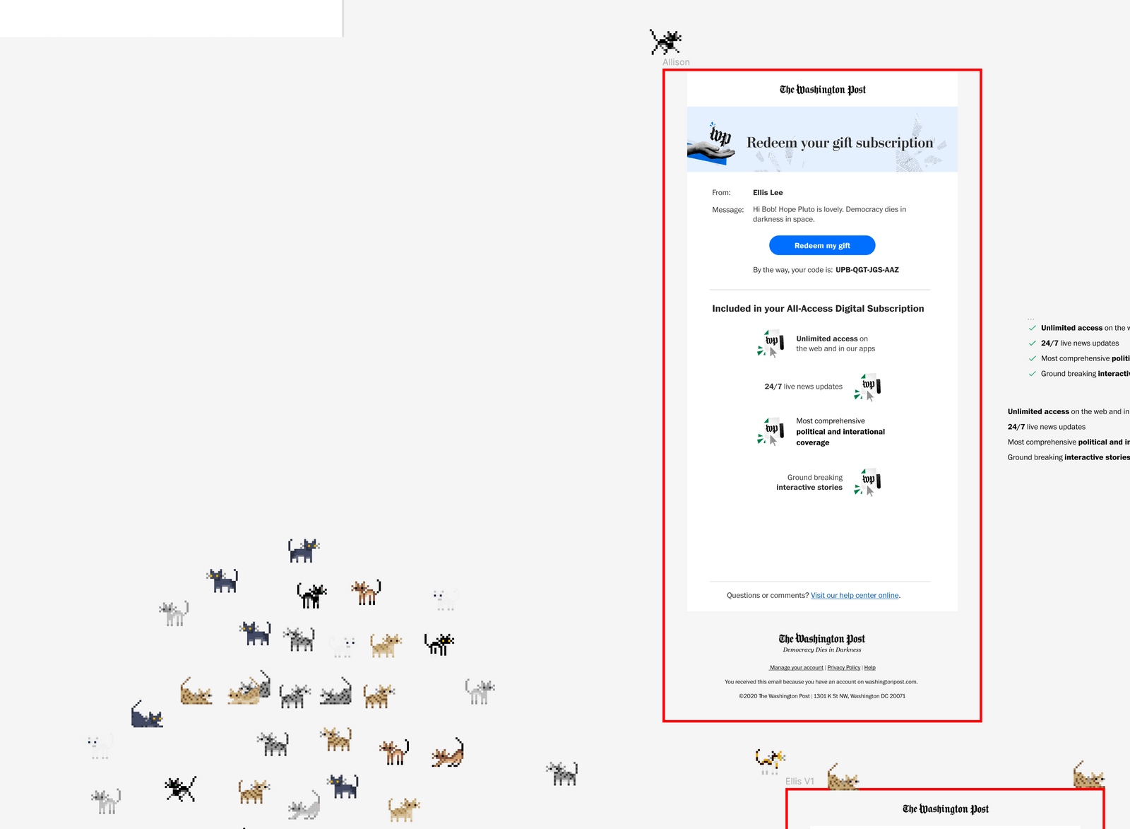
For the recipient email, we also updated to a new template and updated the information hierarchy and copy to reflect that this was an exciting gift email with relevant information and not spam. We also added the details of whats included in the subscription to further entice the user to redeem for all the benefits.
Before
After
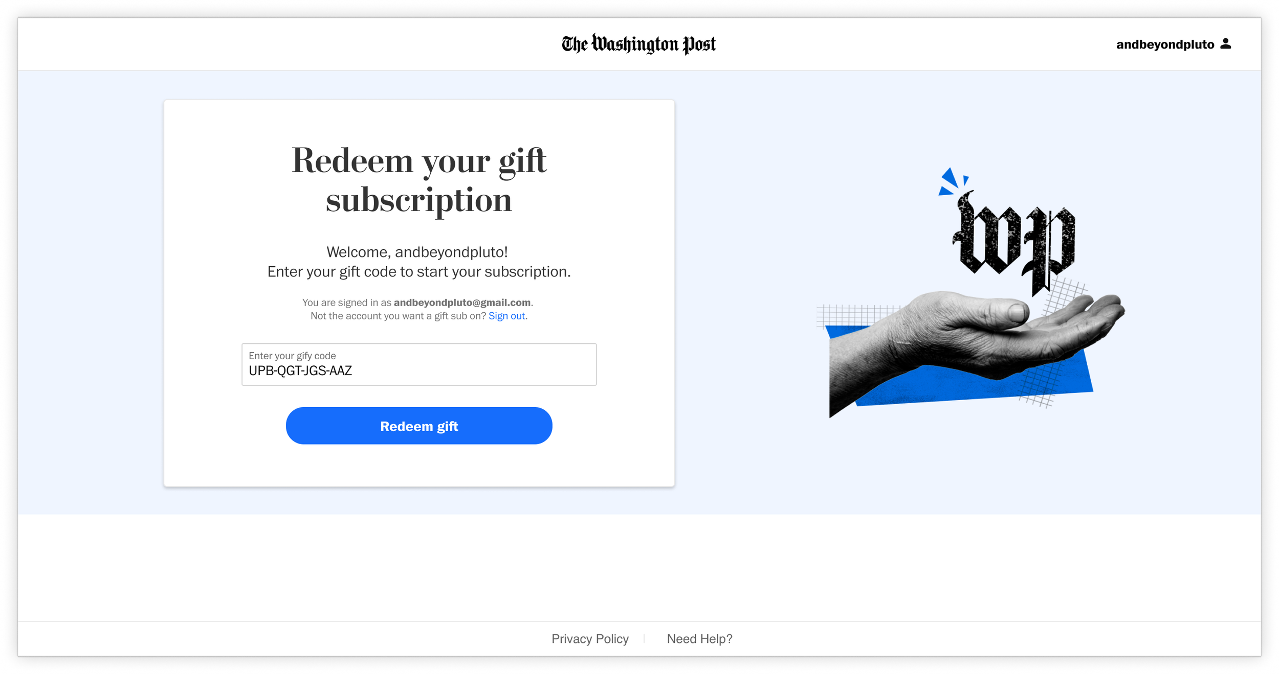
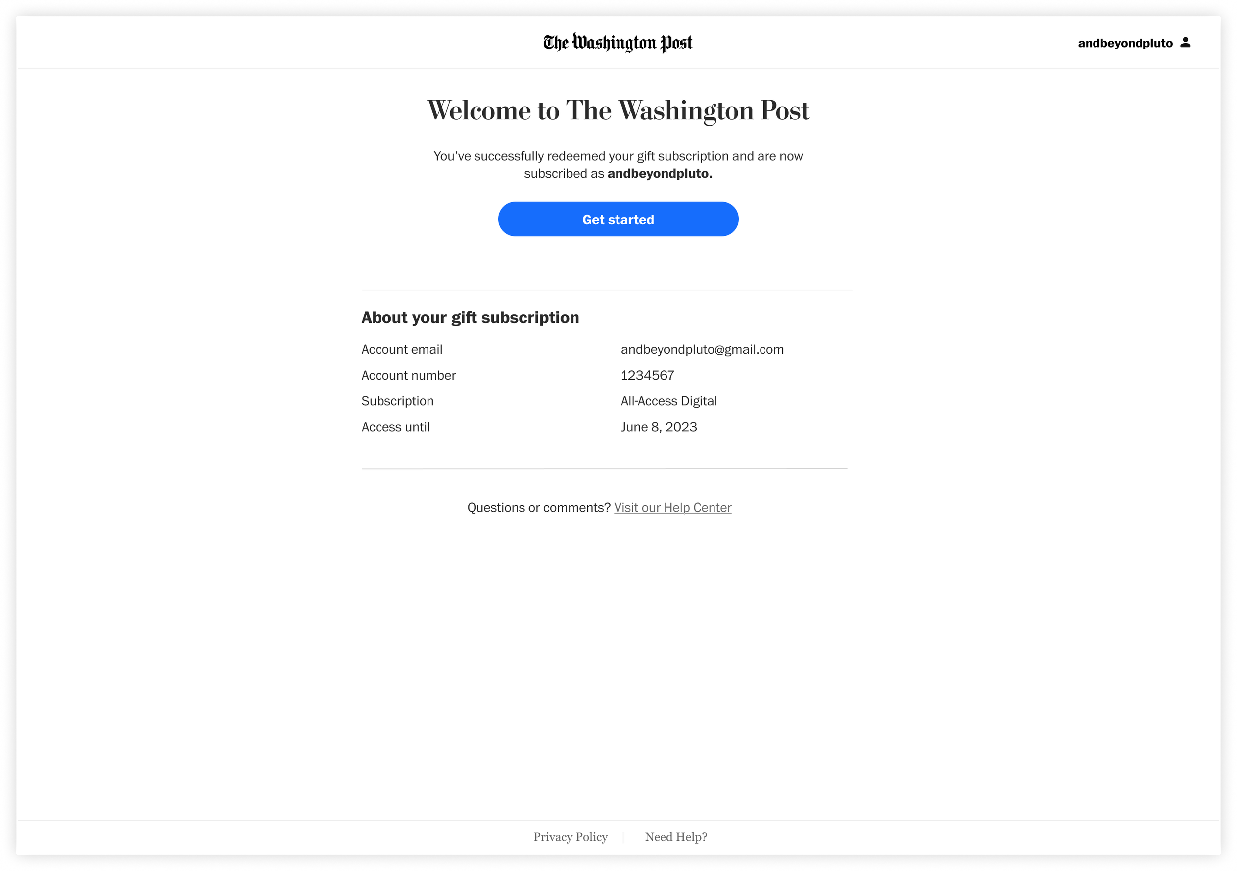
And lastly, we updated the redemption page and confirmation page to our updated design language. We included opportunities to sign into the account you wanted to apply the gift to (or create a new one) and added our subscriber onboarding flow after the welcome experience to further nurture these new users.

Conclusion
This project was a joy and a homerun from the start. Being able to walk through my design discovery and execution process with someone new to product design was a delight! I was able to share my excitement for discovering new insights, finding ideas, strategically delivering the designs to product management, and more. I walked through discovery tools like data analytics dashboards and tips for how to keep tabs on KPIs that might fall of radars. We practiced using impact vs effort matrixes to identify low lift wins and must have high light work to product management. And most of all, we had a blast (interns have a way of adding fun to every Figma file).
Who even knew there was a cat plugin??