The Washington PostDemonstrating value of registration
Optimizing wall strategy and performance.

Registration as a strategy
As a member of the Grow team at The Washington Post, I focused on strategies to attract new readers, build meaningful relationships, and drive conversions. One key initiative was the introduction of a registration wall as a transitional step toward full subscription. This allowed readers to engage with our content while experiencing the value of a subscription firsthand.
Registration testing revealed compelling results: compared to control groups, registered users returned to the site more frequently, subscribed at a 68% higher rate than anonymous users, and demonstrated 9% higher subscription retention. Additionally, registration enabled us to gather insights into readers’ behaviors across platforms and devices, empowering us to deliver personalized recommendations and content. This approach not only enhanced the user experience but also established a more stable subscription growth model, reducing reliance on the unpredictable surges driven by the news cycle.
Identifying an Opportunity Area
During my qualitative user testing of the registration wall, I identified a key barrier: a gap in user understanding of the benefits of registration compared to subscription. Continuing user research and my own studies revealed that readers were often unaware of the unique value tied to simply creating an account, leading to low motivation for registration. This disconnect limited our ability to capture potential leads and engage readers early in their journey. I wanted to create a new wall that clarified the distinct advantage of account creation vs. subscription, thereby increasing user registrations, expand our lead pool, and establish a more robust pipeline for future conversions and engagement.
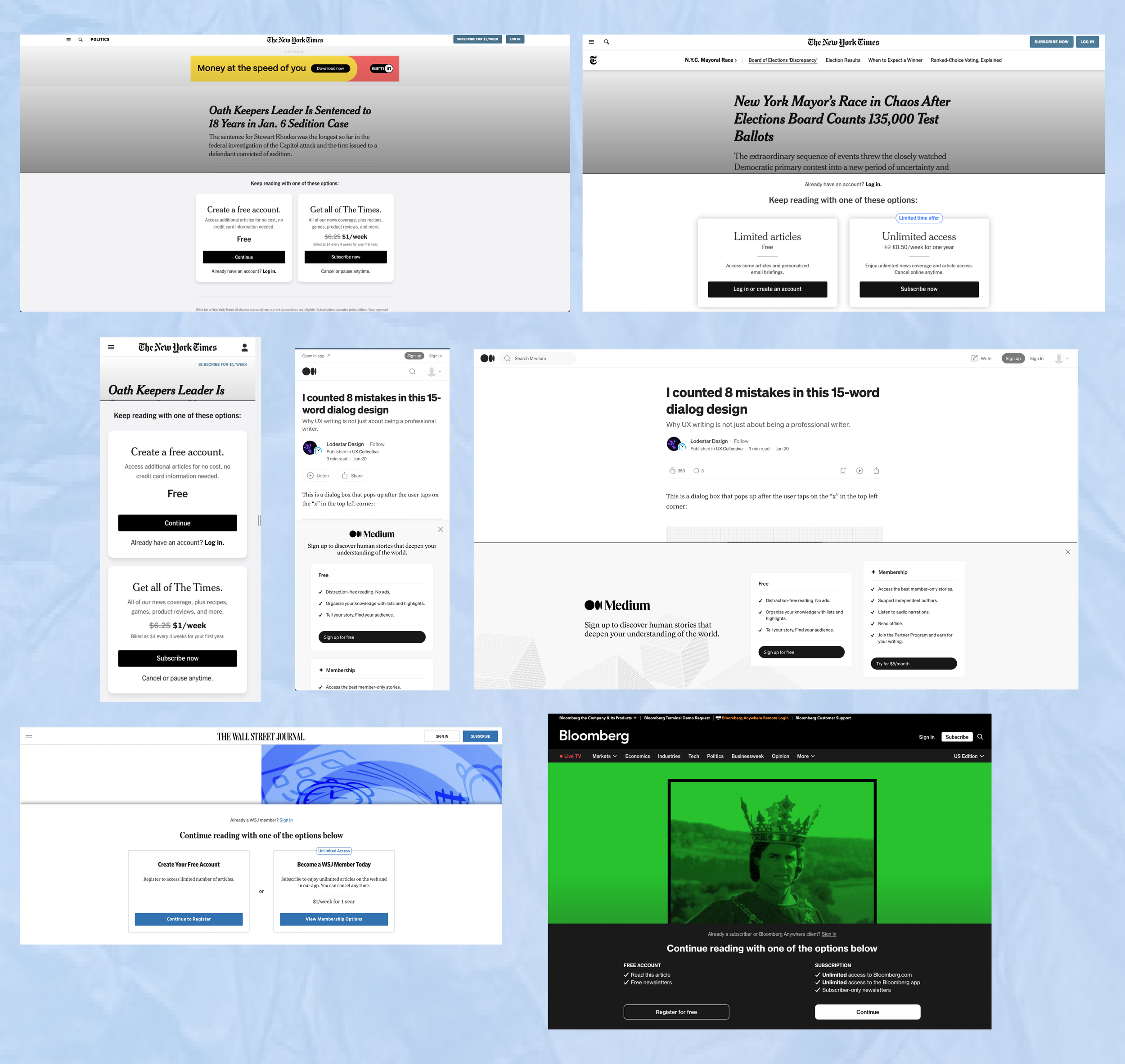
Current Registration Wall and Paywall

The registration wall (regwall) and paywall
Both our registration wall and paywall had been through multiple A/B tests to optimize messaging and improve user understanding. For instance, including messages like "No credit card required" consistently performed better on the registration wall, increasing user clarity and engagement. However, qualitative user testing consistently revealed a persistent misconception: many users still perceived the registration wall as a paywall, expressing reluctance to proceed under the assumption they would need to pay. In contrast, the paywall, deliberately positioned differently to distinguish it from the registration wall, was consistently recognized as requiring payment. This feedback highlighted the need for further refinement in messaging and design to address these misperceptions and enhance the overall user experience.
Ideating

Presenting my idea
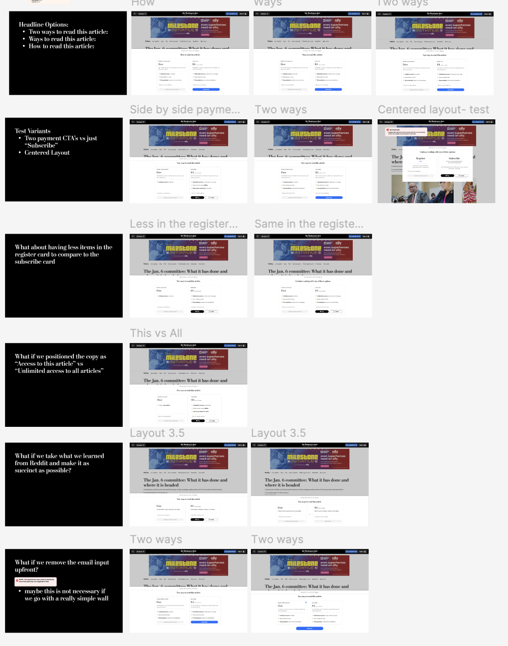
To refine my approach, I developed several design variants and outlined the pros and cons of each before presenting my concept, the "Hybrid Regwall," to my product manager, manager, and marketing team. I framed my hypothesis as follows: "Displaying a registration offer alongside a subscription offer will increase the registration take rate by clearly demonstrating the value of registering for free compared to subscribing for a fee."
The design was well-received, and we refined it into a clean, streamlined iteration for testing. During discussions, an additional use case emerged: leveraging the wall to display two subscription offers side by side, enabling users to compare benefits and enhancing engagement with subscription offers normally hidden away. This insight expanded the strategic scope of the design and influenced its development trajectory.
To move forward, I collaborated with the engineering and product teams to identify efficient ways to build and test the wall. We paired down some of the subscription capabilities initially designed and focused on increasing the wall's modularity. This future-proofed the design, ensuring it could easily accommodate follow-up testing for two subscription offers if the initial concept proved successful.
Drawing inspiration from product pages that compare access tiers or product levels, I conducted a competitive analysis across various industries to identify best practices for presenting information clearly and effectively.
I began to look for ways within the small space to layout all the necessary information. I worked with content design and marketing to find the right balance of features to list for a registration against subscription. I created variants that were anchored to the bottom of the page and ones that were centered to the page more like the paywall.
✨ Final Solution and Impact

Registration wall vs Multi-Offer wall
The wall was rebranded as the "Multi-Offer Wall" to highlight its ability to present two distinct offers simultaneously to users. A two-week A/B test comparing it to the existing registration wall delivered outstanding results: registrations increased by 71%, subscription starts grew by 82%, and registered users through the wall converted at a 59% higher rate. These compelling outcomes energized the entire team. As a result, Product and Marketing made the strategic decision to replace the current registration wall with my new Multi-Offer Wall design in 2023, marking a significant enhancement in user registration and conversion strategy.
Conclusion
This project was incredibly fulfilling, as it enabled me to turn user insights into a strategic solution that advanced our registered user goals. Drawing from these insights, I developed and presented initial design concepts to product management, working closely with stakeholders to secure a place on the roadmap. Collaborating with engineering, I created minimum viable design iterations, allowing us to test and refine the approach with agility and adaptability.
Following the launch, I planned several iterative updates to support ongoing testing and optimization, ensuring continuous improvement. It has also been rewarding to see many of our competitors adopt and test similar wall designs following the success of our launch—a testament to the impact of our work.