Personal Project
Yelp Collections Redesign
Redesigned Yelp’s collection feature to increase visibility and reduce drop off.
Role
UX Designer
Time
June 2021
Tools
Figma, Maze
Introduction
Yelp is a place to look at local restaurants, read customer reviews, and choose where to eat!
And while Yelp is great for all those things - they fail at my favorite thing: organizing.
Being a huge foodie and avid organizer, I love to use Yelp and spreadsheets to map out the food scenes in cities I am going to visit. I comb through Yelp to find restaurants that interest me and simply add them to my collection… except it isn’t simple.
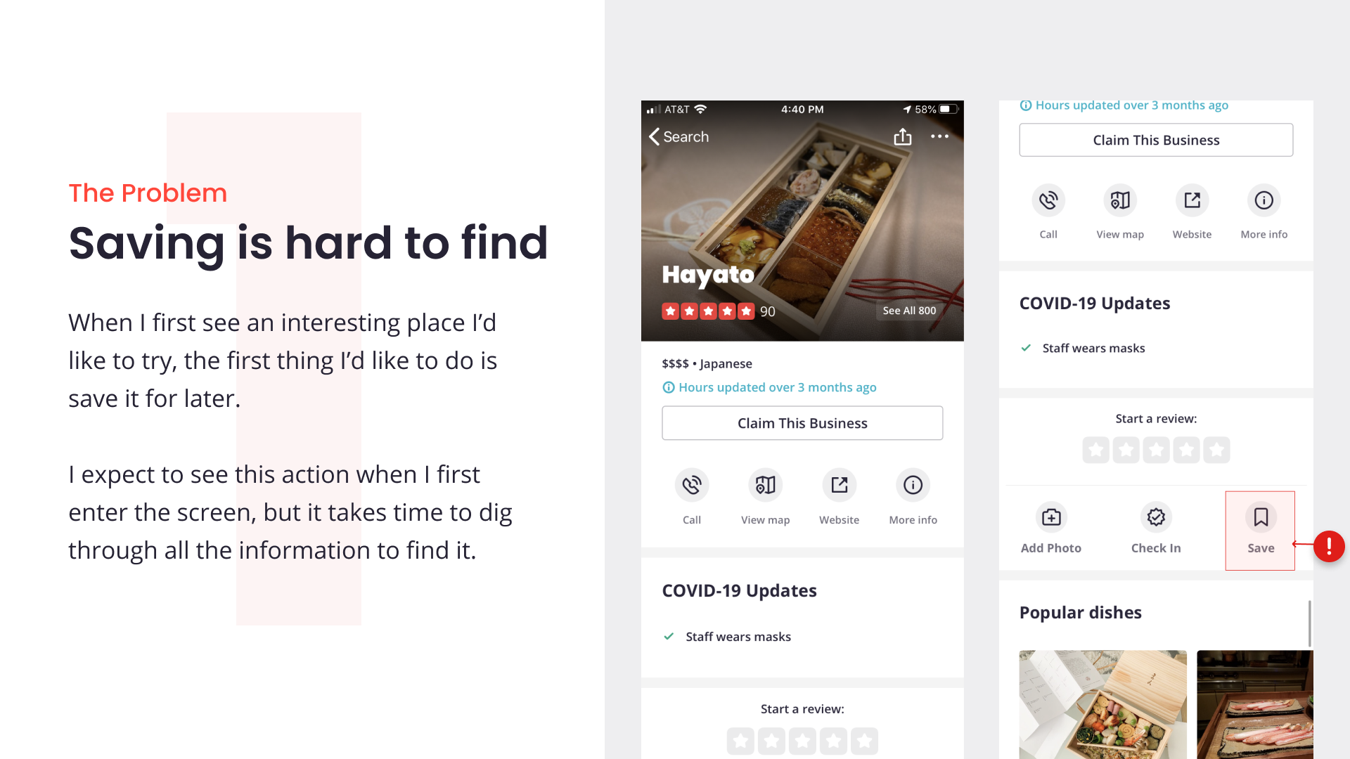
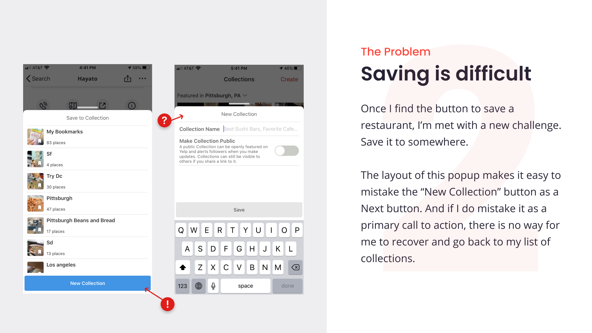
Although I’ve been through the workflow countless numbers of times, each time I want to add a new restaurant to a collection, I have difficulty finding the bookmarking tool. Eventually the whole process is so frustrating that I leave the collecting for Google Sheets.
This presented an opportunity to create a more substantial collection experience for Yelp users. One that would give users a reason to open the app more often and made it easy to organize their interests.
Deconstructing the Existing Design
Research
User Interviews
To better understand user behavior and to gauge feature awareness, I conducted 8 user interviews.
Research Questions:
Tell me about the last time you went somewhere and found a new place to eat?
How do you go about finding a new place to eat?
What apps do you use for restaurants?
What do you like/dislike about them?
What do you see as the primary functions of yelp?
Are you aware that Yelp offers a collections feature?
The Results
All 8 users used Yelp as their primary app to explore places to eat and was key to their workflows.
7 out of 8 users said they also used Google Maps and said they had no dislikes when using it.
Only 2 out of 8 users were aware of Yelp’s collection feature and 5 users said they would use it if they had known about it.
When prompted to list primary functions of Yelp, the most common answers were: Reviews and Pictures.
Usability Testing
I also ran users through a user test of the current Yelp collections workflow to identify pain points to iterate and improve. This also helped me establish a baseline to improve against.
As users went through the workflow of adding a restaurant to a collection and finding their collection, users most struggled with:
Saving to their collection
“I would have never expected it [the save button] to be there.”
“Any saving stuff I expect to find it [the save button] without much effort”
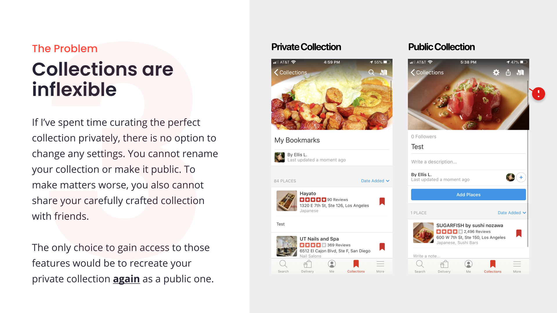
Finding the collection they saved to
Competitor Analysis
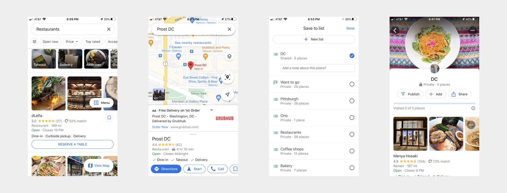
Since 7 out of 8 users listed Google as their sole other restaurant exploration app, I analyzed it to learn what was working well.
I found a lot of the things I had been wishing Yelp’s collections had.
It was quick and easy to save something the moment I found it interesting.
When adding something to list, I could add it to multiple lists at once.
It was quick and easy to change my list to public, add locations, and share with any friends.
The Solution
Measuring Success
I conducted a usability test of my solution to see how it improved discoverability and discover any usability challenges the users might be facing with the redesign. Overall the redesigned workflow faired much better in usability testing and discoverability than the current Yelp design. While 67% of testers were unaware of the Yelp Collections feature, after trying it in the test, 57% said they would like to use it in the future.


